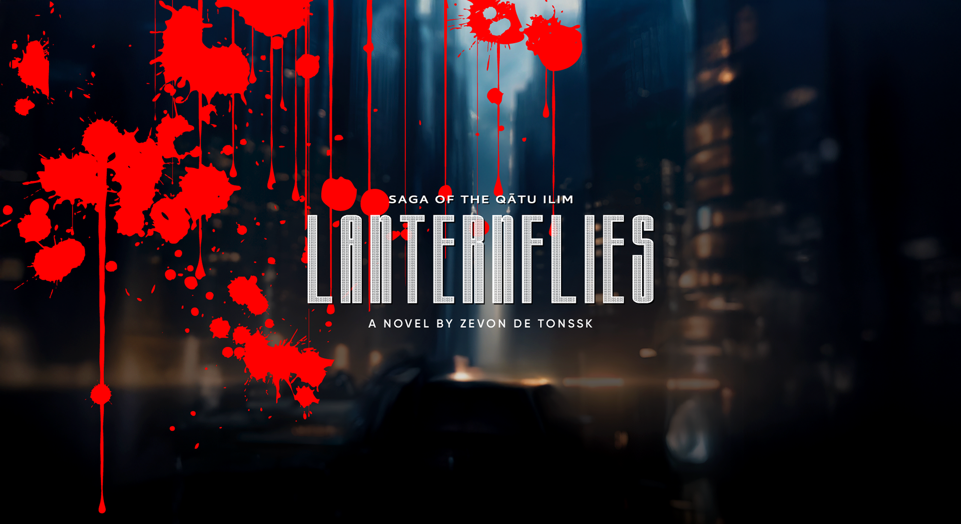
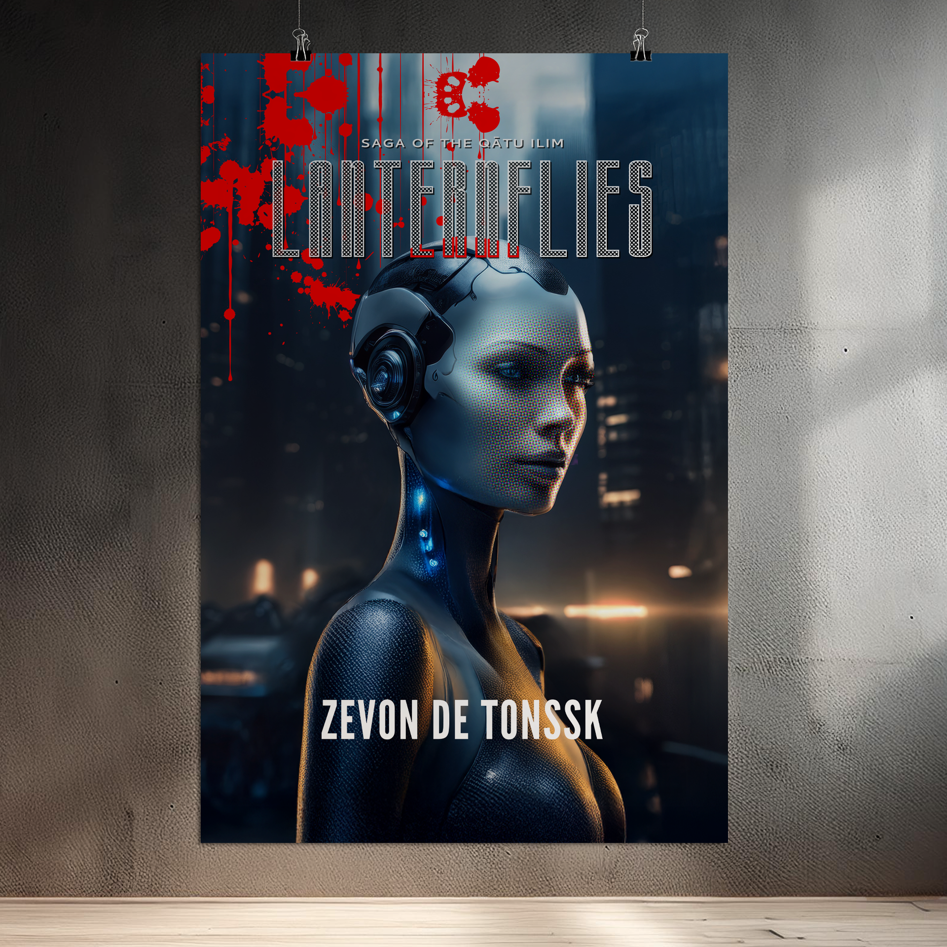
Zevon's artwork and typography that he personally designed for the book. Lanternflies is the first book in the trilogy Saga of the Qãtu Ilim (pronounced Kah-Too-EA-Leem), a name derived from the ancient Akkadian language meaning "Hand of God." This is Zevon’s debut novel, the result of years dedicated to research and writing.
Social Media Promotional Video
Hard Cover Release Promotional Video
Title Design:
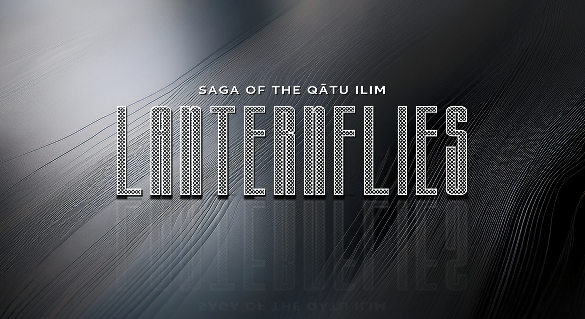
The title design is based on the font "Herculine Regular" expanded 10%, spaced, outlined with a 40% white dot fill on a black background. The pre-text is set in Bank Gothic.
Cover Design and Art:
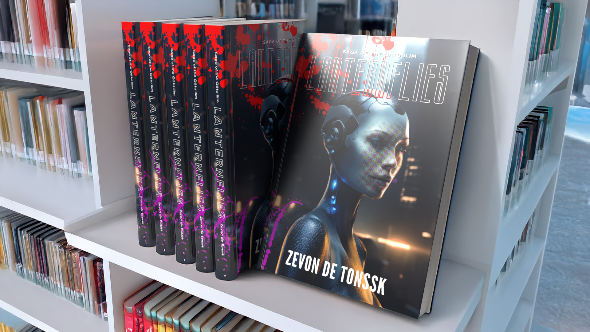
As a self-published 612-page paperback distributed through Amazon, the cover art needed to meet specific criteria based on the paper stock, page count and book dimensions. These included the size and placement of the ISBN barcode and the overall layout. Additionally, the design had to reflect the tone and genre of the story.
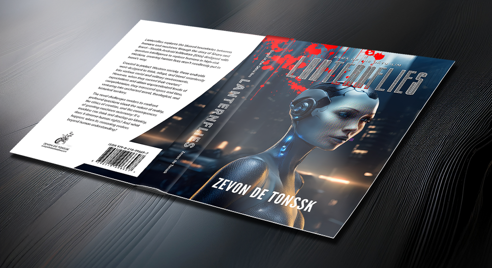
Cover illustration:
The complete illustration extends beyond what is visible on the paperback edition, as it was originally created to meet the full trim and bleed specifications for the hardcover version as well.
While the story centers around two artificial-intelligence androids, it also confronts many social norms and begs us to question our perception of reality.

Illustrative Subject:
The protagonist, Sharu, is a Stealth Android Infiltrator equipped with quantum intelligence, engineered to replace humans in high-risk missions and ensuring human lives aren’t needlessly put in harm’s way. Developed to safeguard Western society, Sharu was designed to think critically, adapt rapidly, and integrate seamlessly into both social and military environments. However, when Sharu surpasses the expectations of its creators and achieves unprecedented levels of comprehension, the narrative takes an unexpected turn.
Cover Illustration Depiction:
The android features a nanomaterial epidermis capable of simulating human skin. However, when it enters dark mode, the human skin simulation is deactivated, revealing a Vantablack exterior that is resistant to extreme environments and abrasion.
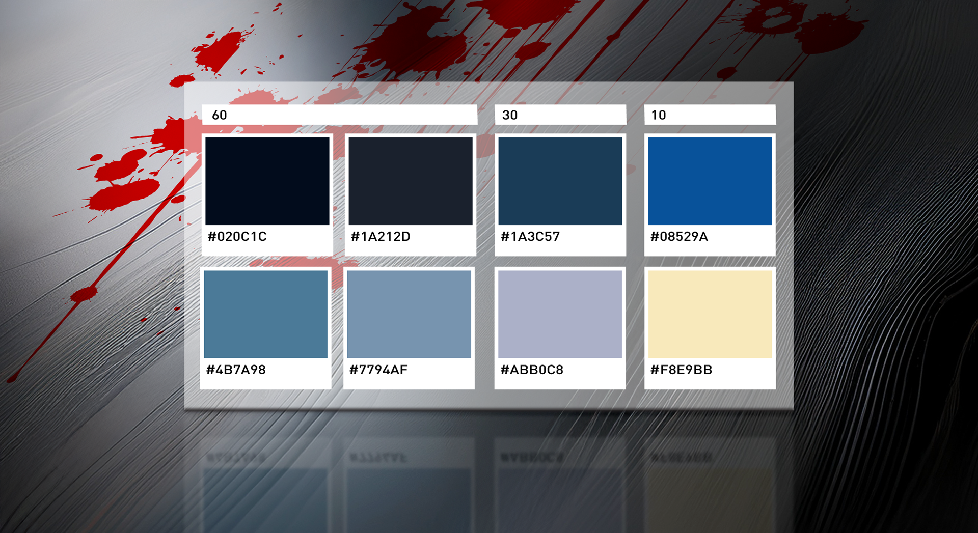
Cover Illustration Color Palette:
The cover illustration color palette adheres to the cinematic 60/30/10 color rule and utilized cool muted hues inspired by Giger's work. Though not shown, bright red color (#FF0000) is used in spatters on the cover to signify the element of violence contained within the story.
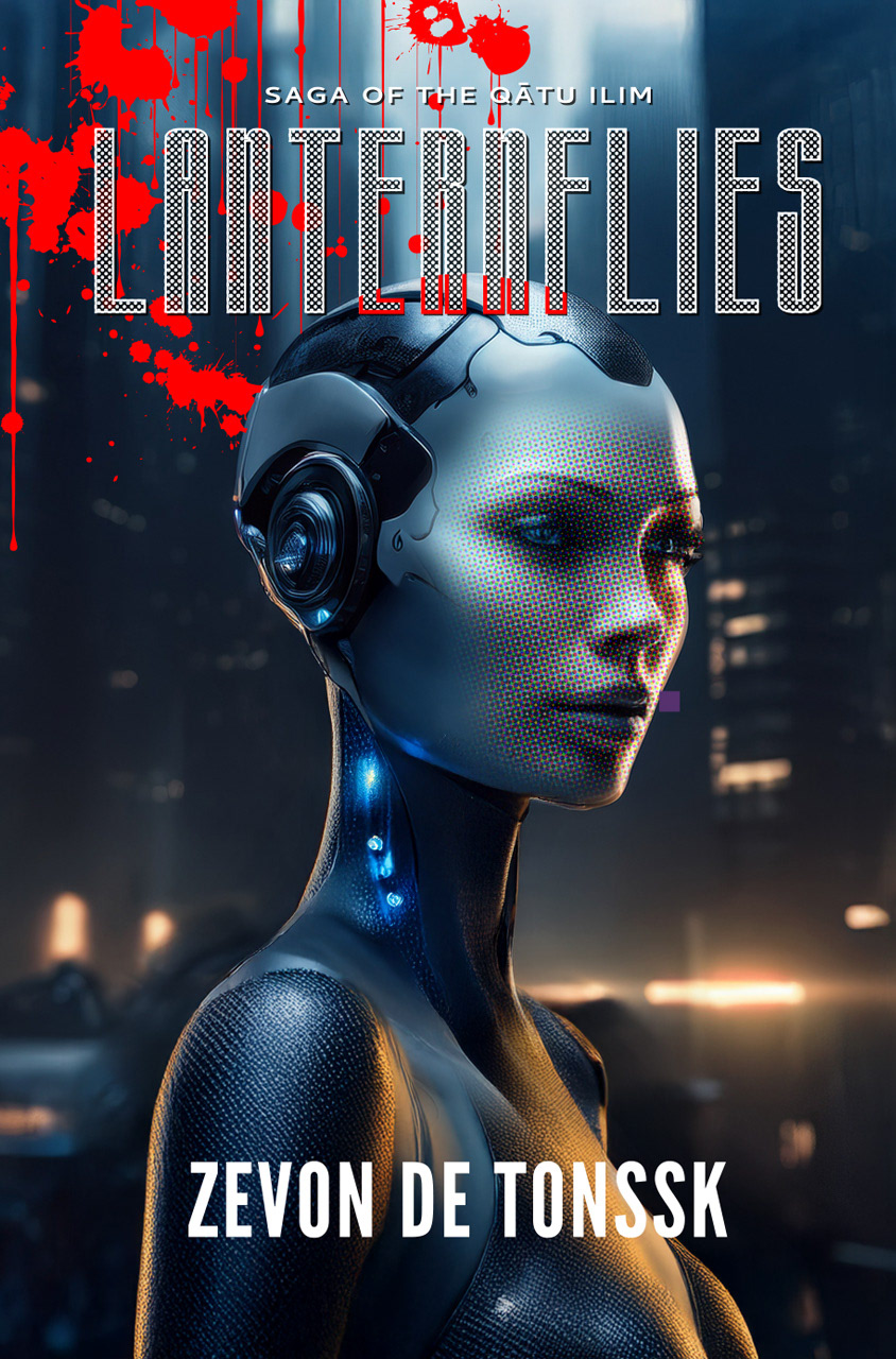
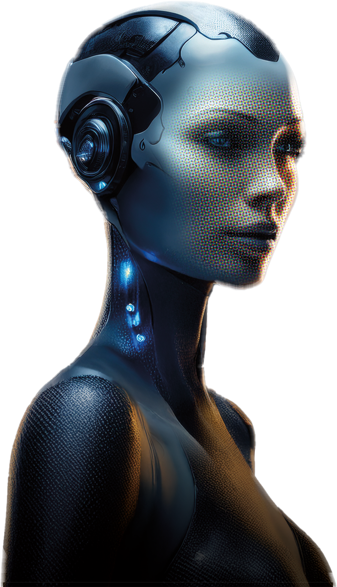
Illustration Techniques:
Photoshop's Generative AI was used, utilizing the "Generative Fill" feature to support the creative process. The background and subject were developed separately, and the face was composited from different renderings. To enhance the overall visual style, "Color Halftone Dot" filter effects were applied to selected areas of the image.
Typography and Page Layup:
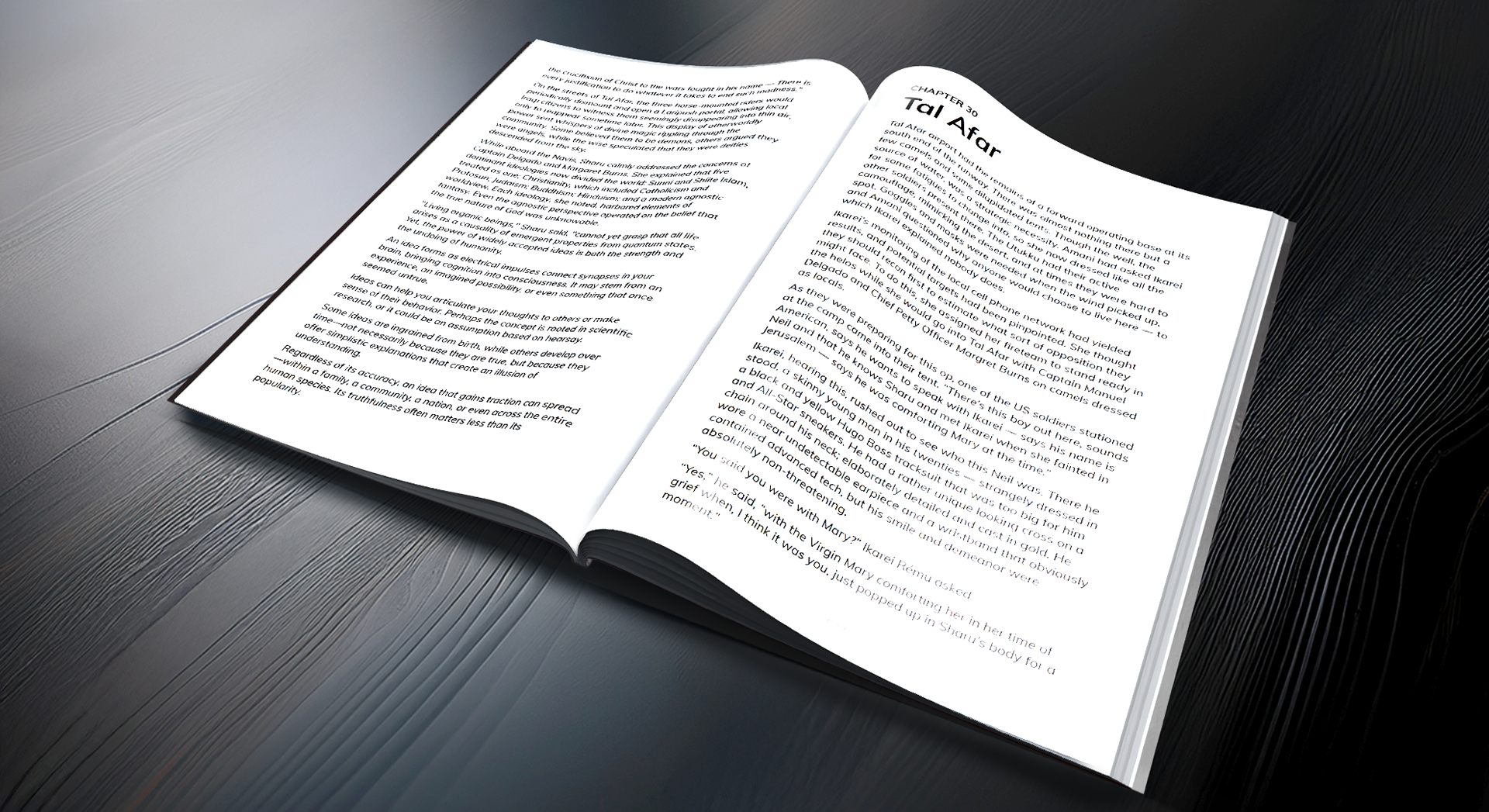
For optimal readability in the 612-page paperback edition, Zevon chose to keep the line spacing (leading) open and set the entire book in 10.5 pt Muli Regular, with 30 pt bold headings and 12 pt subheads. Even using standard single line spacing in the Apple Pages app, the typeface provided visually superior leading compared to other fonts under consideration, such as Graphik and Helvetica. The slightly taller ascenders in the Muli sans-serif typeface contributed to a subtle but noticeable improvement in overall legibility.
Promotional Poster:
A high resolution image of the cover art is available as a 24 x 36 inch poster and in smaller sizes of the same proportions.
Social Media Marketing:
Preliminary video animation containing a vertical Instagram 5 second "Call to Action"